NEW EDGE AI
BRAND Redesign
Branding
〰️
Product Design
〰️
System Design
〰️
Branding 〰️ Product Design 〰️ System Design 〰️
New Edge AI is an agent-orchestration platform for B2B commerce. B2B buying is famously slow and complex and New Edge puts AI agents across that whole funnel: acquiring and onboarding customers, building quotes, extending credit, even negotiating bulk pricing — all inside a single chat experience powered by the client's own data.
It's a technical, trust-sensitive product touching a lot of different surfaces — which is exactly why it needed a brand system that could make all of it feel like one credible company. As the founding designer, I built that system end to end — from the logo mark to how the agents themselves speak.
Where It Started
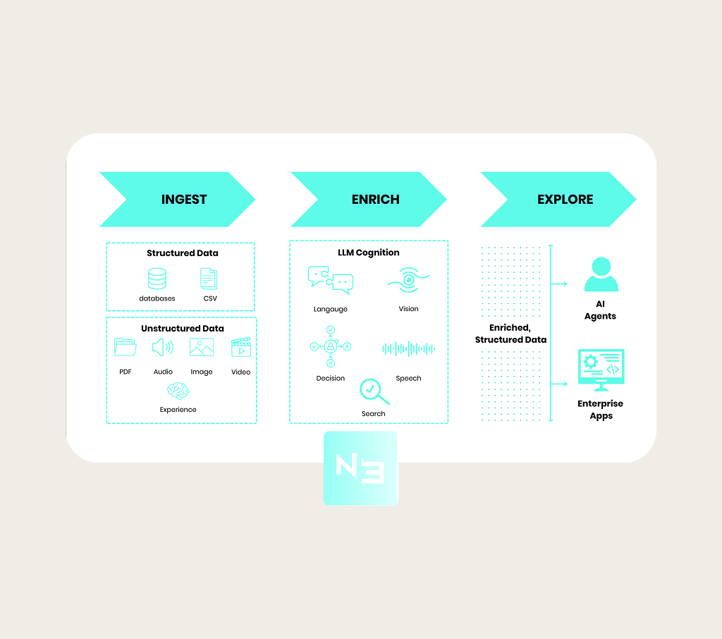
Poor Contrast
Text and UI fought their backgrounds. Legibility & accessibility were an afterthought.
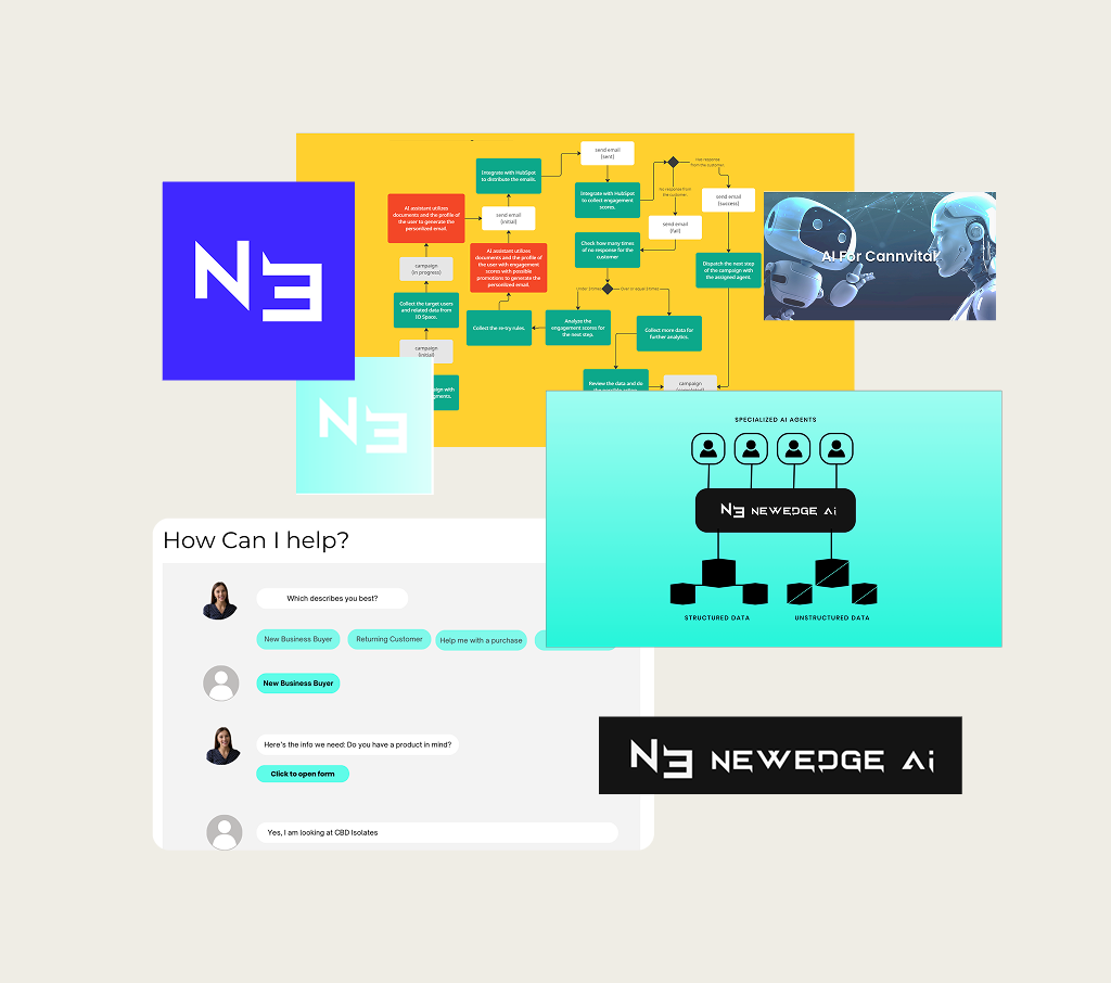
Scattered Designs
Every deck and one-pager used a different look. Nothing signaled the same company.
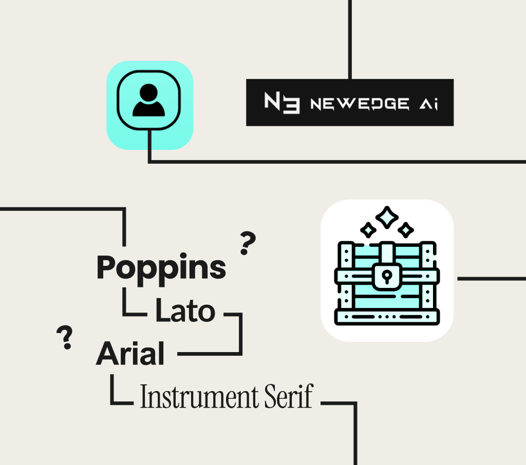
No System
No colors, type, or components to reuse. Each asset was rebuilt from scratch.
The Opportunity
Early-stage companies have to earn trust before their product can prove itself. I saw a gap that mattered more than aesthetics. New Edge AI was ready to be trusted, but didn't yet look it. I proposed a real brand system, not just a logo, and the cofounders gave me the room to build it end to end.
Establishing
the Mark
Logo
I wanted the mark to do more than represent New Edge AI. I wanted it to encode what the company actually does. The NE initials carry the full name, and AI is hidden inside the N itself, so the company's purpose lives inside its own logo. The geometry is built from precise 90 and 45 degree angles, the same clarity and efficiency the product promises its customers. Royal blue, teal, and magenta carry that idea further, built to read as trust, innovation, and action at a glance.
I built the palette around two primaries, blue and teal, so they could carry the brand everywhere without competing for attention. Magenta is used sparingly, as an accent that calls out the moments that matter most, the same role it plays inside the logo mark itself.
A full neutral range, from white to black, gives the product team room to build interfaces without ever touching the brand colors incorrectly.
Colors
The Palette

Colors
The Gradient
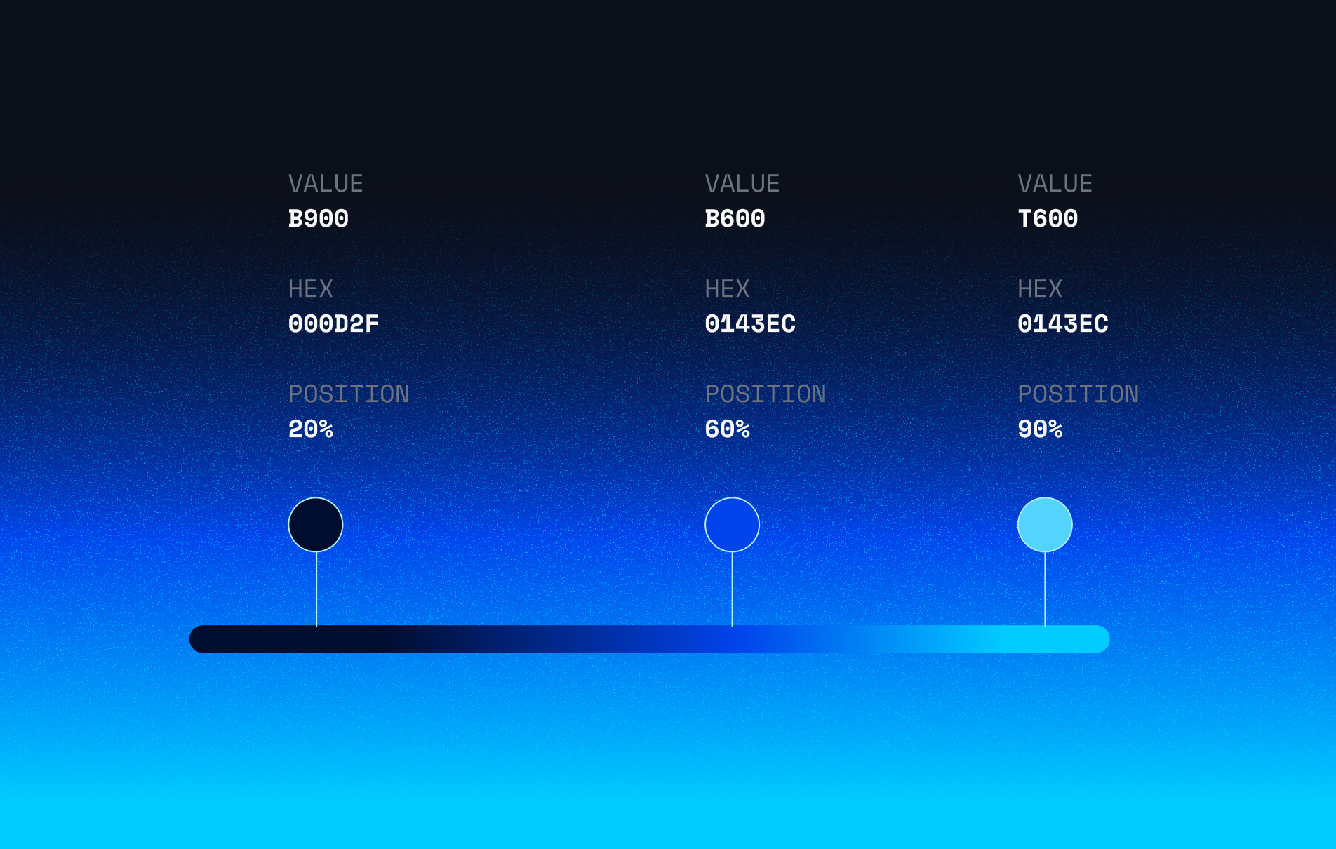
I wanted the gradient to do more than look good behind a headline. It moves from midnight blue to primary blue to teal, and that motion carries meaning. Sophistication grounds the brand, trust builds through the middle, and teal closes on energy and efficiency. It's become one of the most recognizable touches across the brand, the same idea showing up in a hero banner, a pitch deck, or the product itself.
Designing
for the build
Iconography
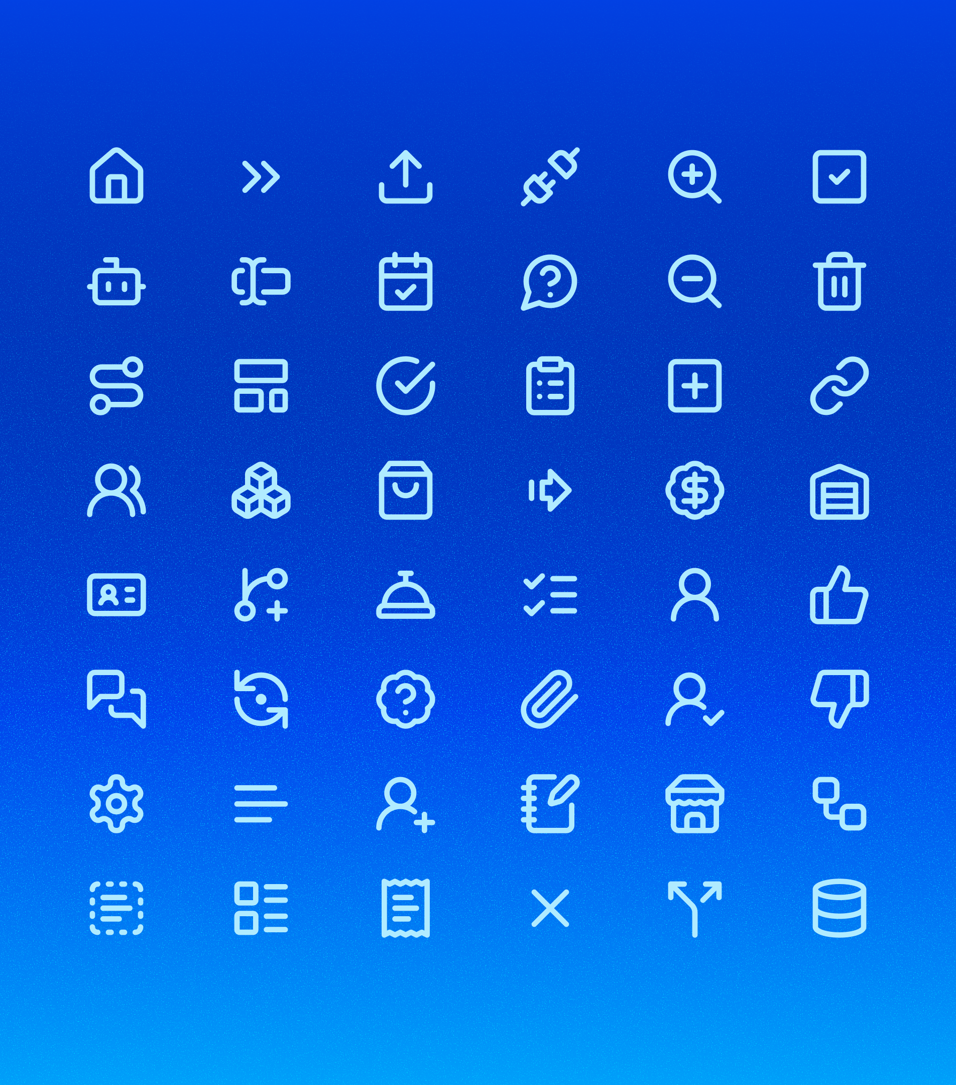
I worked directly with the engineering team to understand how the product was actually being built. That changed my approach to icons. Instead of custom illustration, I curated a set of developer-familiar icons the team could pull straight from a shared library, kept consistent in weight and style across every use. New icons get added without ever waiting on me, and the product stays visually consistent as it grows.
Designing
for the build
Chat Agent Avatar
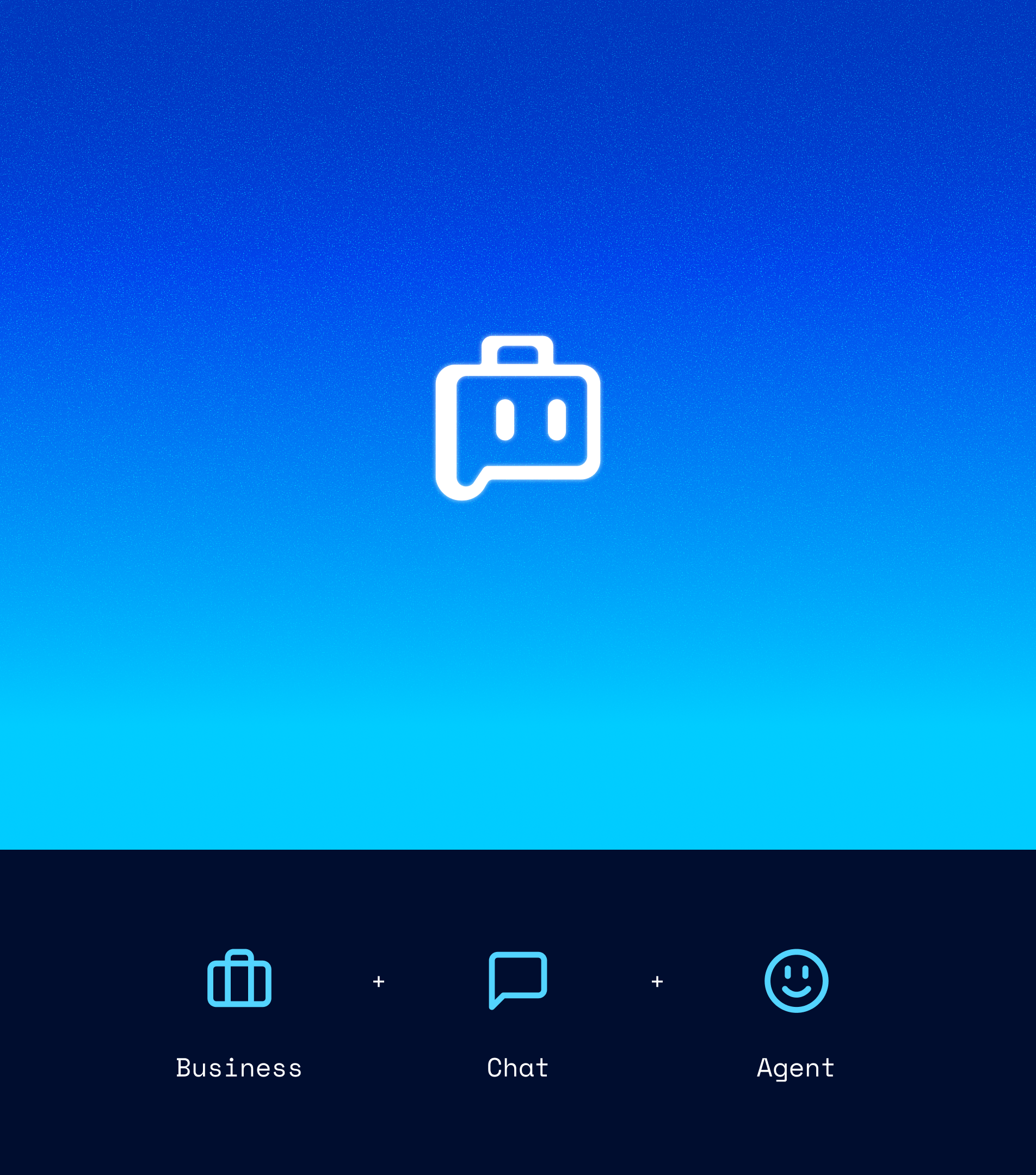
The chat agent needed its own identity, separate from the rest of the brand. I combined a briefcase, a chat bubble, and a pair of eyes into a single mark, one icon that says business, conversation, and presence all at once. It's the first thing a buyer sees when the agent introduces itself, so it had to carry trust before a single word was said.
Brand Guidelines
The Living Document
This is the complete system in one place. Every decision on logo, color, type, and icon usage, documented clearly enough for anyone on the team to apply it correctly. It's also where the agent voice and tone work lives now, the newest layer I'm still building out as the product grows.
Out In The Wild
Website
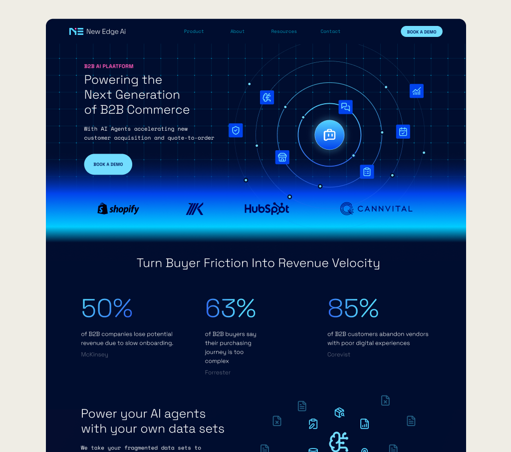
One brand, one voice, from hero to footer.
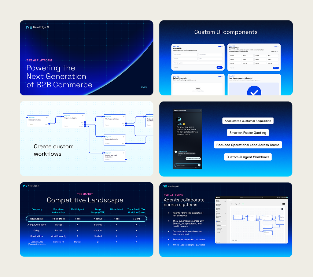
Presentations
Every deck now opens looking like the same company.
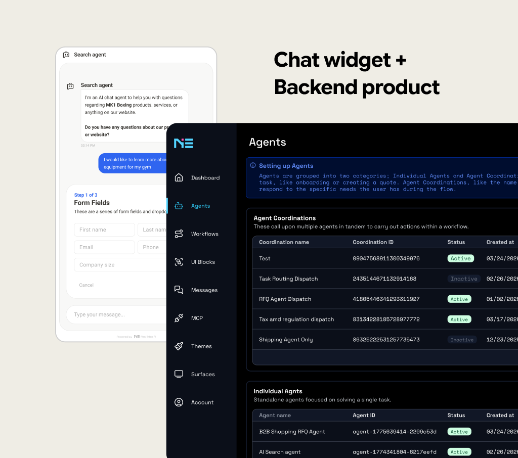
Product
The system carries straight into the interface.
The IMPACT
The brand gave New Edge AI something to point to. It carried the company through conversations with a handful of investors, and it helped bring on 5 pilot companies now testing the product in the real world. The work didn't stop at launch. I'm still building with the team today, extending the same system into the standalone app that's next for the company.